Adobe Illustrator to get Photoshop's most popular AI tools By Georgia Coggan published 23 April 24 Generative Fill and Generative Expand are coming to vector.
Vertex 2024 - our best bits and some surprises By Beth Nicholls, Natalie Fear, Ian Dean published 23 April 24 We had a blast at Vertex 2024, here are the highlights.
Hilarious PETA billboard births the internet's new favourite phrase By Natalie Fear published 23 April 24 Who needs complicated copywriting?
Everyone will want to use Photoshop's upcoming People Distractions Tool By Georgia Coggan published 23 April 24 And two other cool Adobe Max Sneaks.
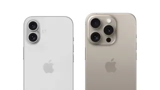
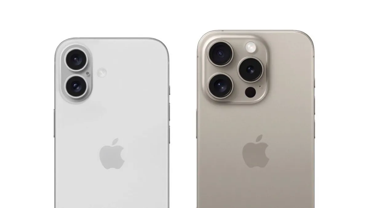
Apple's iPhone 16 camera already sounds sensational By Daniel John published 23 April 24 We're getting a clear picture of this year's setup.
People are mesmerised by these charming LED light paintings By Joe Foley published 23 April 24 A fusion of art and light.
Minimalist website design: 12 striking examples By Creative Bloq Staff, Mark Billen published 23 April 24 Web Design These minimalist site designs prove that less can be more.
Vertex 2024 - our best bits and some surprises By Beth Nicholls, Natalie Fear, Ian Dean published 23 April 24 vertex We had a blast at Vertex 2024, here are the highlights.
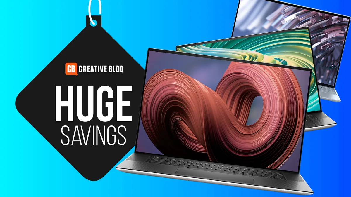
Dell's best laptops for creatives get massive price drops in flash sale By Joe Foley published 23 April 24 eCommerce Save up to $900 on a Dell XPS.
Hilarious PETA billboard births the internet's new favourite phrase By Natalie Fear published 23 April 24 News Who needs complicated copywriting?
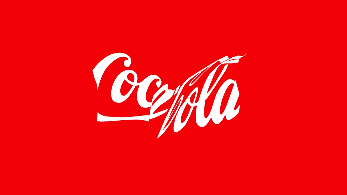
The best rebrands of 2020s (so far) By Antonia Wilson published 23 April 24 Branding From nostalgic revisions to bold new campaigns – these are the best rebrands of the decade, as picked by industry experts.
Apple's iPhone 16 camera already sounds sensational By Daniel John published 23 April 24 News We're getting a clear picture of this year's setup.
Vertex 2024 - our best bits and some surprises By Beth Nicholls, Natalie Fear, Ian Dean published 23 April 24 vertex We had a blast at Vertex 2024, here are the highlights.
Hilarious PETA billboard births the internet's new favourite phrase By Natalie Fear published 23 April 24 News Who needs complicated copywriting?
Apple's iPhone 16 camera already sounds sensational By Daniel John published 23 April 24 News We're getting a clear picture of this year's setup.
How to design a logo: 15 pro tips By Nick Carson, David Airey last updated 11 April 24 Logos Learn how to design a logo with these top tips for successful branding.
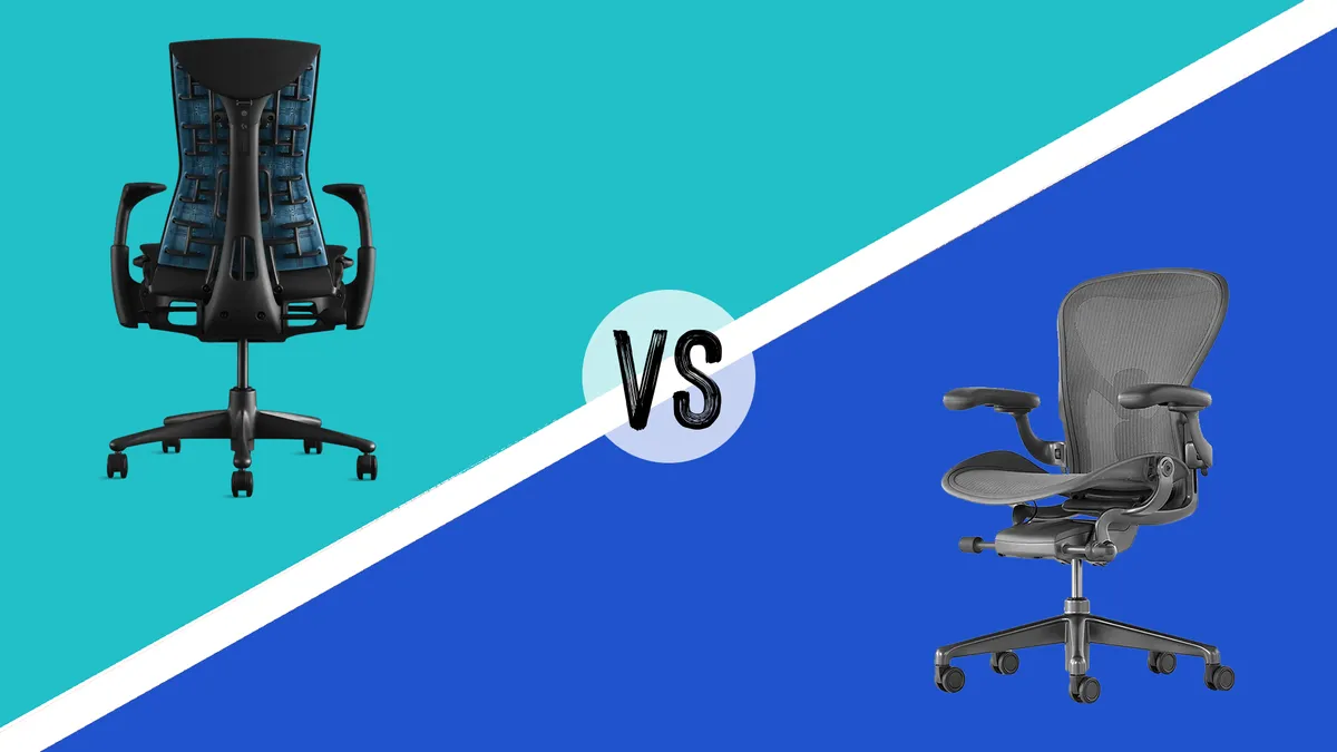
Herman Miller Aeron vs Embody By Beren Neale published 4 April 24 Lifestyle Two high-end office chairs go head-to-head.
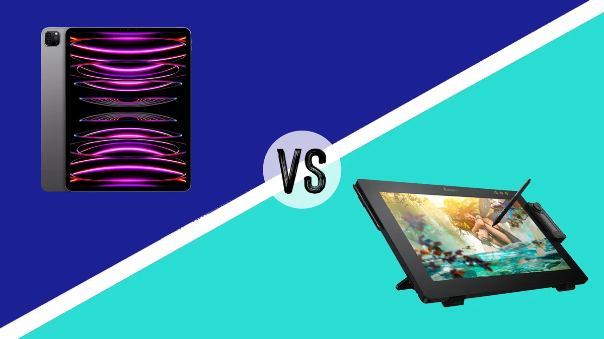
iPad vs drawing tablets: which one should you get? By Beth Nicholls last updated 3 April 24 Trouble deciding on an iPad or dedicated drawing tablet for your digital art? We can help.
How much does it cost to build a website? By Jon Stapley published 29 March 24 Setting up a website for your business? We take a no-nonsense look at what you can expect to pay to build a website.
Minimalist website design: 12 striking examples By Creative Bloq Staff, Mark Billen published 23 April 24 Web Design These minimalist site designs prove that less can be more.
The best Cricut Easter ideas: egg-cellent craft inspiration for the holidays By Mollie Davies published 27 February 24 Art Video tutorials for the best Cricut Easter ideas.
What NOT to get a graphic designer for Christmas By Nick Carson last updated 19 December 23 Lifestyle Avoid ruining a designer's Christmas with this handy guide.
LightWave 2023 review: 3D software makes strong return By Paul Hatton published 23 April 24 3D LightWave is back in the game thanks to a raft of new features, including an Unreal Engine bridge.
NYXI Hyperion Pro review: this retro-style joypad is the answer to stick drift By Beth Nicholls published 21 April 24 gaming controllers This purple retro joypad from NYXI is a delightful alternative to standard Nintendo Switch Joy-Cons.
Acer Predator Helios Neo 16 review: powerful, noisy, bulky - everything you need from a gaming laptop By Ian Evenden published 19 April 24 Laptops A gaming laptop with plenty of ports and an attractive screen.
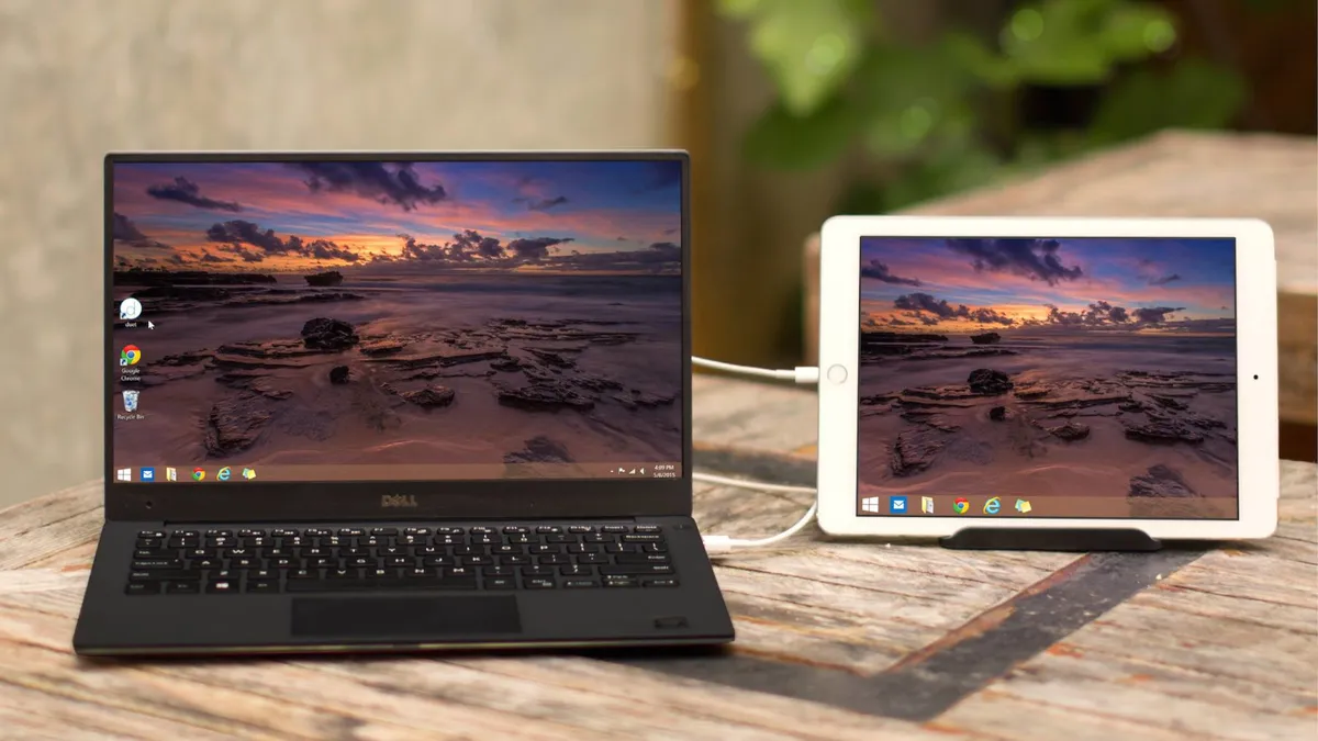
How to use an iPad as a drawing tablet with a PC By Jon Stapley published 17 April 24 Tools Want to use an iPad as a drawing tablet with a PC? There are a number of ways to do it
How to sit properly in a chair By Tom May published 17 April 24 Save your back, with our guide to how to sit properly in a chair
How to install apps on a laptop By Joseph Foley published 8 April 24 Hardware We walk through how to install apps on a laptop, including how to download games to a laptop.
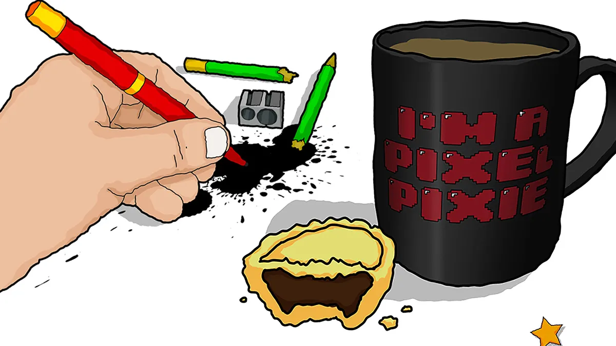
7 secret Photoshop AI tricks you need to know By Martin Nebelong published 8 April 24 Digital Art How to get better at Photoshop's AI tools.