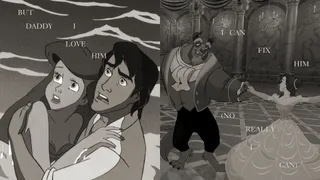
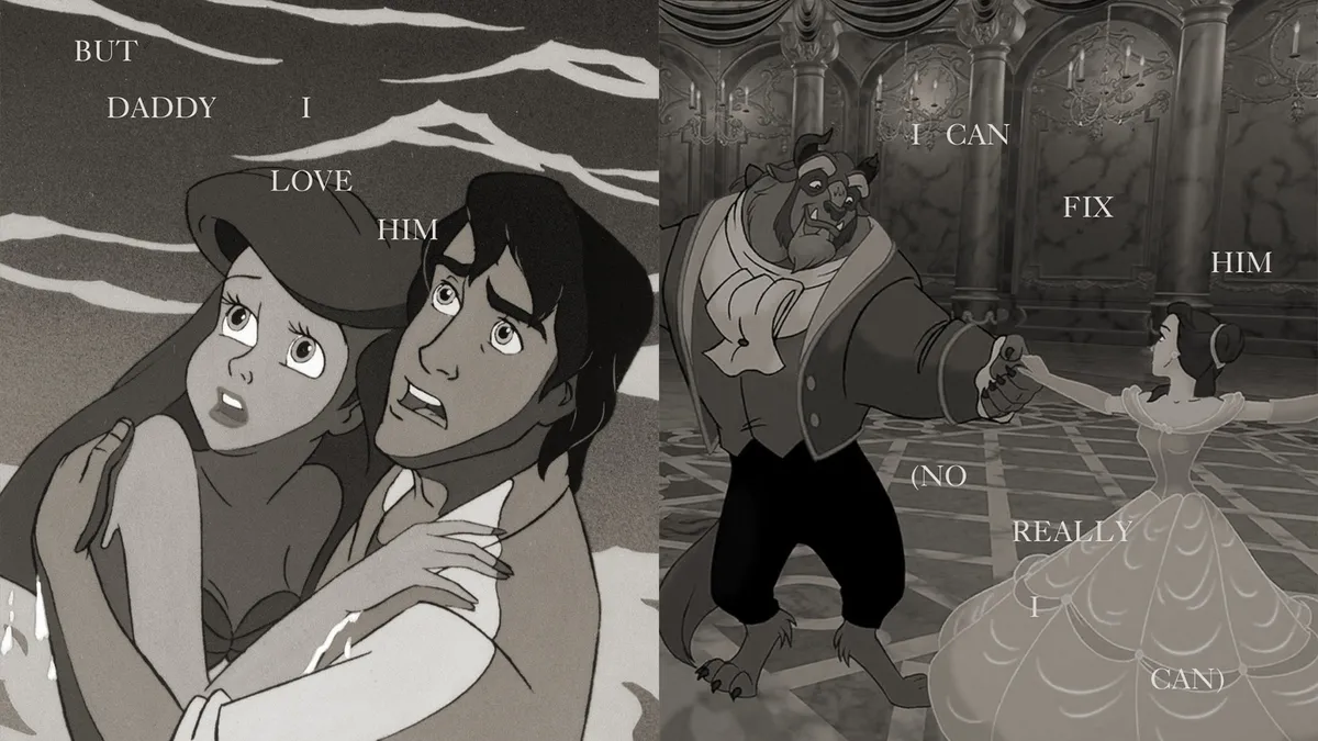
Tortured Poets Department (Disney's Version) is a delight for fans By Natalie Fear published 26 April 24 Calling all Disney Swifties.
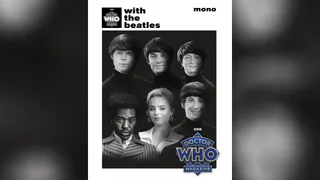
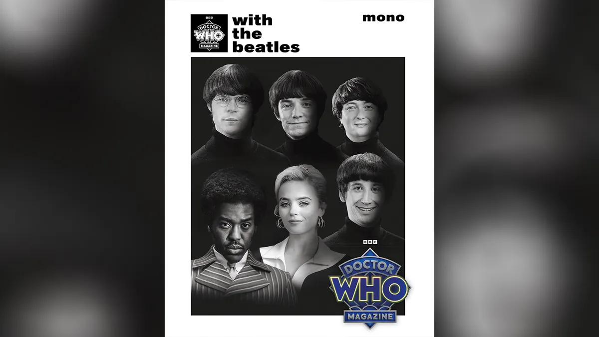
Cringe Beatles x Dr Who magazine cover looks like a tribute band parody By Natalie Fear published 26 April 24 I’ve officially lost faith in the franchise.
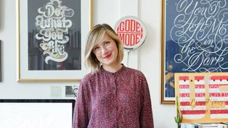
Should creatives work for free? That depends, says Jessica Hische By Rosie Hilder published 26 April 24 Lettering artist shares how to navigate getting paid.
Bizarre AI camera turns images into sonnets and haiku By Joe Foley published 26 April 24 A very different type of AI art generator.
“Unwarranted and relentless”: Baseball team rejects logo design dispute By Natalie Fear published 25 April 24 The US Interior Department considers it a foul.
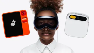
Looks like the AI gadgets are in trouble By Daniel John published 25 April 24 Teething problems haunt the Humane AI Pin and Rabbit R1.
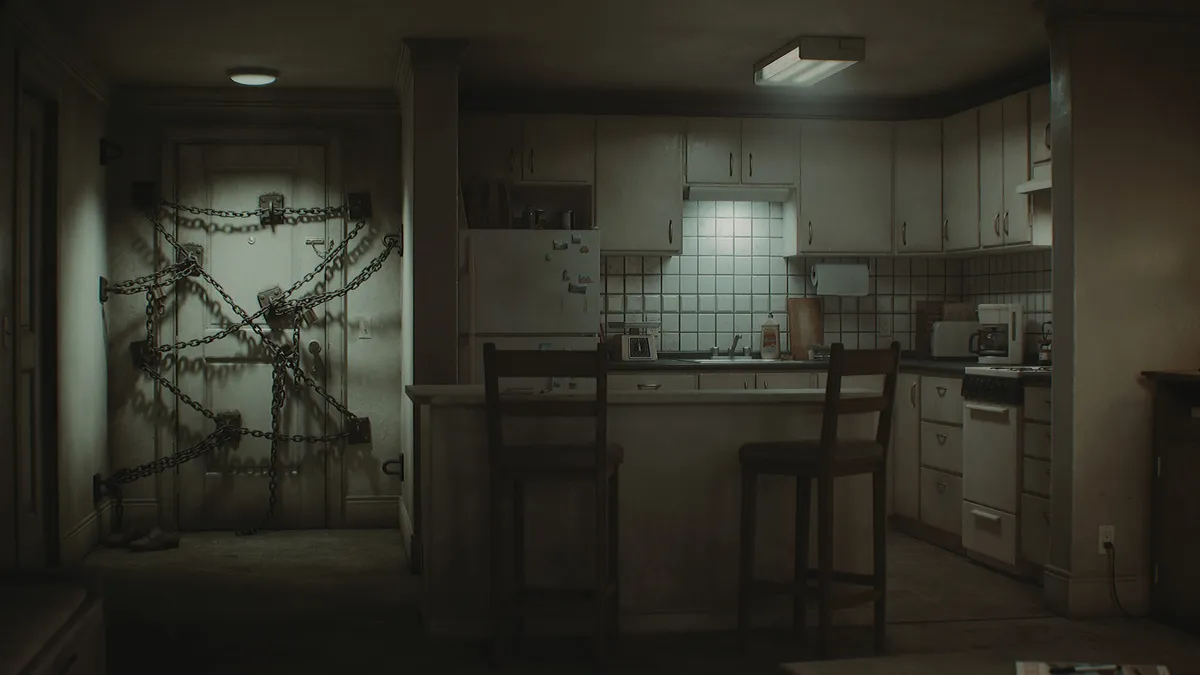
How to create realistic game interiors in Unreal Engine 5 By Maxim Dorokhov published 26 April 24 Digital Art Maxim Dorokhov shows how to make realistic gaming interiors in Unreal Engine 5, using the apartment from Silent Hill 4.
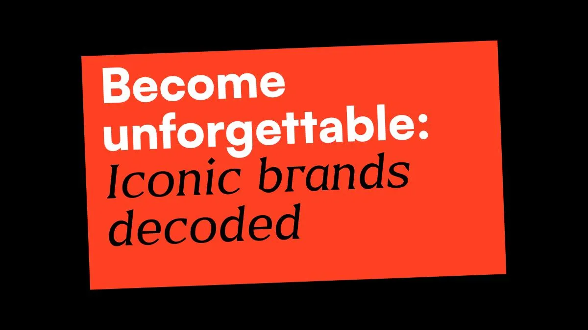
What makes some brands so iconic? By Jem Saka published 26 April 24 Branding We dissect the likes of Apple, Louis Vitton and Liquid Death.
Cringe Beatles x Dr Who magazine cover looks like a tribute band parody By Natalie Fear published 26 April 24 News I’ve officially lost faith in the franchise.
The best laser cutters and engravers By Ian Dean last updated 26 April 24 3D Cut, score and engrave with accuracy using the best laser cutters.
Bizarre AI camera turns images into sonnets and haiku By Joe Foley published 26 April 24 Digital Art A very different type of AI art generator.
“Unwarranted and relentless”: Baseball team rejects logo design dispute By Natalie Fear published 25 April 24 News The US Interior Department considers it a foul.
Cringe Beatles x Dr Who magazine cover looks like a tribute band parody By Natalie Fear published 26 April 24 News I’ve officially lost faith in the franchise.
Bizarre AI camera turns images into sonnets and haiku By Joe Foley published 26 April 24 Digital Art A very different type of AI art generator.
“Unwarranted and relentless”: Baseball team rejects logo design dispute By Natalie Fear published 25 April 24 News The US Interior Department considers it a foul.
How to design a logo: 15 pro tips By Nick Carson, David Airey last updated 11 April 24 Logos Learn how to design a logo with these top tips for successful branding.
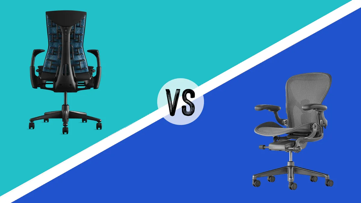
Herman Miller Aeron vs Embody By Beren Neale published 4 April 24 Lifestyle Two high-end office chairs go head-to-head.
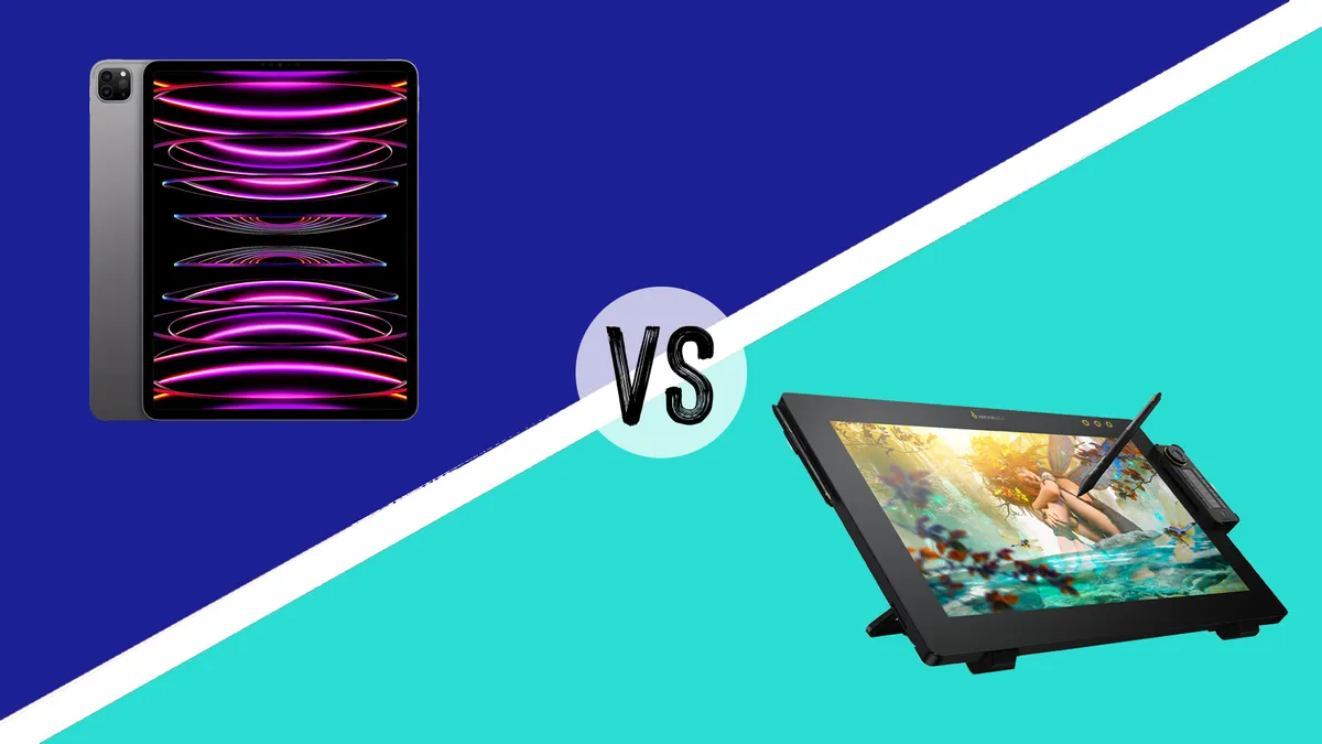
iPad vs drawing tablets: which one should you get? By Beth Nicholls last updated 3 April 24 Trouble deciding on an iPad or dedicated drawing tablet for your digital art? We can help.
How much does it cost to build a website? By Jon Stapley published 29 March 24 Setting up a website for your business? We take a no-nonsense look at what you can expect to pay to build a website.
What makes some brands so iconic? By Jem Saka published 26 April 24 Branding We dissect the likes of Apple, Louis Vitton and Liquid Death.
Minimalist website design: 12 striking examples By Creative Bloq Staff, Mark Billen published 23 April 24 Web Design These minimalist site designs prove that less can be more.
The best Cricut Easter ideas: egg-cellent craft inspiration for the holidays By Mollie Davies published 27 February 24 Art Video tutorials for the best Cricut Easter ideas.
Nothing Ear and Ear (a) review: eye-catching designs meet high-end tech, for less By Ian Dean published 24 April 24 in-ear headphones Sounds like something you'll need, but which is right for you?
LightWave 2023 review: 3D software makes strong return By Paul Hatton published 23 April 24 3D LightWave is back in the game thanks to a raft of new features, including an Unreal Engine bridge.
NYXI Hyperion Pro review: this retro-style joypad is the answer to stick drift By Beth Nicholls published 21 April 24 gaming controllers This purple retro joypad from NYXI is a delightful alternative to standard Nintendo Switch Joy-Cons.
How to create realistic game interiors in Unreal Engine 5 By Maxim Dorokhov published 26 April 24 Digital Art Maxim Dorokhov shows how to make realistic gaming interiors in Unreal Engine 5, using the apartment from Silent Hill 4.
How to use an iPad as a drawing tablet with a PC By Jon Stapley published 17 April 24 Tools Want to use an iPad as a drawing tablet with a PC? There are a number of ways to do it
How to sit properly in a chair By Tom May published 17 April 24 Save your back, with our guide to how to sit properly in a chair
How to install apps on a laptop By Joseph Foley published 8 April 24 Hardware We walk through how to install apps on a laptop, including how to download games to a laptop.